Responsive Design Testing on Real Mobile Devices
Very cool website that lets you test mobile solutions on their real devices, side by side, on their web interface:
Test your website on our real devices.
Let us keep up with the trends for you. We continually add to our device lab as new phones and tablets hit the market.
Streamline your QA process.
Test on more devices more often. Spend time refining your website and not worrying about time and device costs.Test on real devices. See real results.
Perform your responsive design testing by comparing side by side views. Flip orientations from landscape to portrait to compare how your website is rendering.
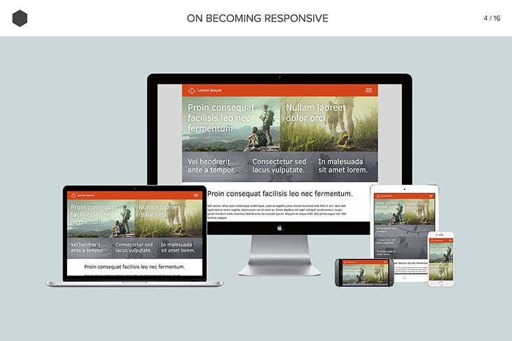
And that’s not all. You can also display selected devices on a background ‘canvas’ to make a great looking presentation:
The prices are pretty reasonable, too. Check it out!
Responsive Design Testing on Real Mobile Devices.
Thanks to Didier Daglinckx for this tip.


