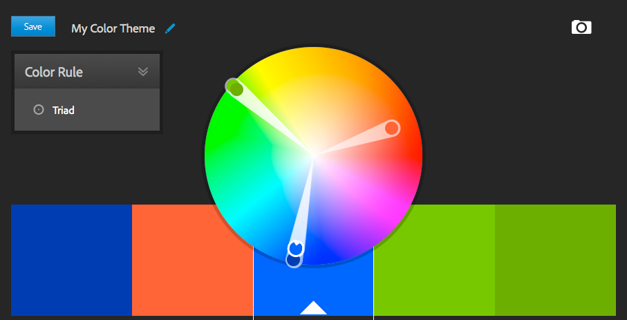
Using Color in FileMaker
Alexis Allen posted a must read article on the use of colors in FileMaker, and covers in quite some detail:
The fourth in a series on the basics of visual design for FileMaker. Colour is one of the most important elements of a design. Since vision is our most dominant sense, colour has an enormous impact on the feeling of a design. But it’s easy to overdo colour, so use it wisely! Here are some important facts about designing with colour.
Subjects covered include:
- Perception
- Purpose
- Colour Models
- Sampling
- Colour Theory
- Color Sampling
- and much more
Interestingly, I read an article the other day about how the word for the color blue does not existing in some cultures (the ancient Greeks, for example). And of course there is the viral picture of the Gold/White Blue/Black dress right now.
The takeaway is, no matter what you use, some will see entirely different colors than you, affecting how they like or interact with your design.
More…Visual Design Basics for FileMaker: Colour – Design for FileMaker Pro Developers.

