Visual Design Basics for FileMaker : Colour
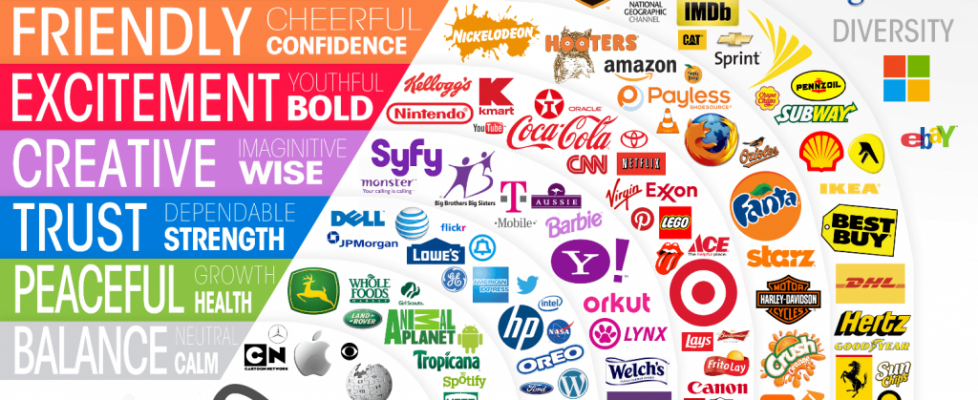
Color (spelled colour in many countries) is a major factor in design, and something to be approached with care. The mood set by the chosen color pallet can make the difference between relaxed and/or anxious users:
Learn how to use colour to set the mood, reinforce the hierarchy, and call attention to important elements in FileMaker visual design….
Colour doesn’t really exist, except in your head. What you experience as colour is in fact different wavelengths of light hitting the red, green, and blue receptors in your eye and being interpreted by your brain. The range of light we can see is called the visible spectrum. You know it as the colours of the rainbow: red, orange, yellow, green, blue, indigo, and violet. Other spectrums of light exist, like infrared and ultraviolet, but we can’t perceive these with our eyes….
Colour theory is the study of how colours are perceived by people. In user interface design, the ideal is to create harmonious, pleasing colour combinations, because these attract the user and support learning and remembering….
There’s much more at the link – choosing pallets, color pickers, additive vs subtractive colors, hexadecimal vs RGB, and much, much more. Alexis Allen comes through again.
By the way, if you are attending Devcon 2015, plan to attend Alexis’s presentation on the psychology of color.
Source: Visual Design Basics for FileMaker: Colour – Design for FileMaker Pro Developers

